The purpose of this project was two-fold. Firstly, to create a cohesive and recognizable visual system for the YouTube tiles and secondly, to create a portal for users to quickly and easily find help videos related to Ignite TV.
Project Details
Timeline: 4 weeks
Deliverables: YouTube Tiles
Tools: Ignite TV, Adobe Photoshop, Illustrator
Project Phases: Copywriting • Competitor Research • Identify Brand Patterns • Visual Exploration • Tile Creation
Team: Przemek Jalowski, Chris Bottecella
Business Objectives
The tiles were created to provide confidence in the brand, and to create a unified identity.
Providing a place people can look when they have an issue, will reduce the number of calls made to customer service and the costs associated with those calls.
User Objectives
Having high quality tiles and a unified brand builds confidence in the company by the user.
By focusing on layout, typography and imagery the user can quickly identify the tiles, and easily find the help they are looking for. By making the process as seamless as possible and the user can go back to enjoying their TV experience sooner.
My Role
I was responsible for competitor and market trend research, visual exploration, and tile creation. I also assisted in the copywriting of the tile titles. I created a visual system for the tiles, effectively conveying the content of the video through text, image and colour, all while following Rogers brand guidelines.
The Problem
There was no consistency of branding or style for any of the Rogers YouTube tiles, looking at the Rogers YouTube page returned a grid of generic, nondescript tiles. Furthermore, if a customer did need help with their Ignite TV, they were unable to find any troubleshooting videos on the platform to help support them as the videos were difficult to find online.
The tiles that did exist, used elements such as text that was not readable, and images that were hard to see and did not indicate the content of the video.
Discover
RESEARCH
In order to get a better understanding of what would be needed for a successful YouTube tile which would work on mobile, desktop and TV, I looked up best practices and standards, comparing multiple websites and competitor YouTube pages.
In order to get a better understanding of what would be needed for a successful YouTube tile which would work on mobile, desktop and TV, I looked up best practices and standards, comparing multiple websites and competitor YouTube pages.
INSIGHTS
To make a successful brand tile that users will want to click on, the tile should contain these key elements: feature the video title, have good text and colour contrast, an interesting or descriptive image, a readable font, and a consistent brand between tiles.
To make a successful brand tile that users will want to click on, the tile should contain these key elements: feature the video title, have good text and colour contrast, an interesting or descriptive image, a readable font, and a consistent brand between tiles.
CONSTRAINTS
Working within an established brand with a focus on a singular platform comes with its own unique challenges. Some challenges included the use of already established brand colours, fonts and layouts that had strict guidelines that needed to be followed at all times. As well as the product always needing to be featured showcasing the video content. Although these restrictions can be very limiting, with the right solution all tiles that follow this format will be consistent yet not repetitive, easily recognizable and further the brand.
Working within an established brand with a focus on a singular platform comes with its own unique challenges. Some challenges included the use of already established brand colours, fonts and layouts that had strict guidelines that needed to be followed at all times. As well as the product always needing to be featured showcasing the video content. Although these restrictions can be very limiting, with the right solution all tiles that follow this format will be consistent yet not repetitive, easily recognizable and further the brand.
Ideate
STYLE EXPLORATION
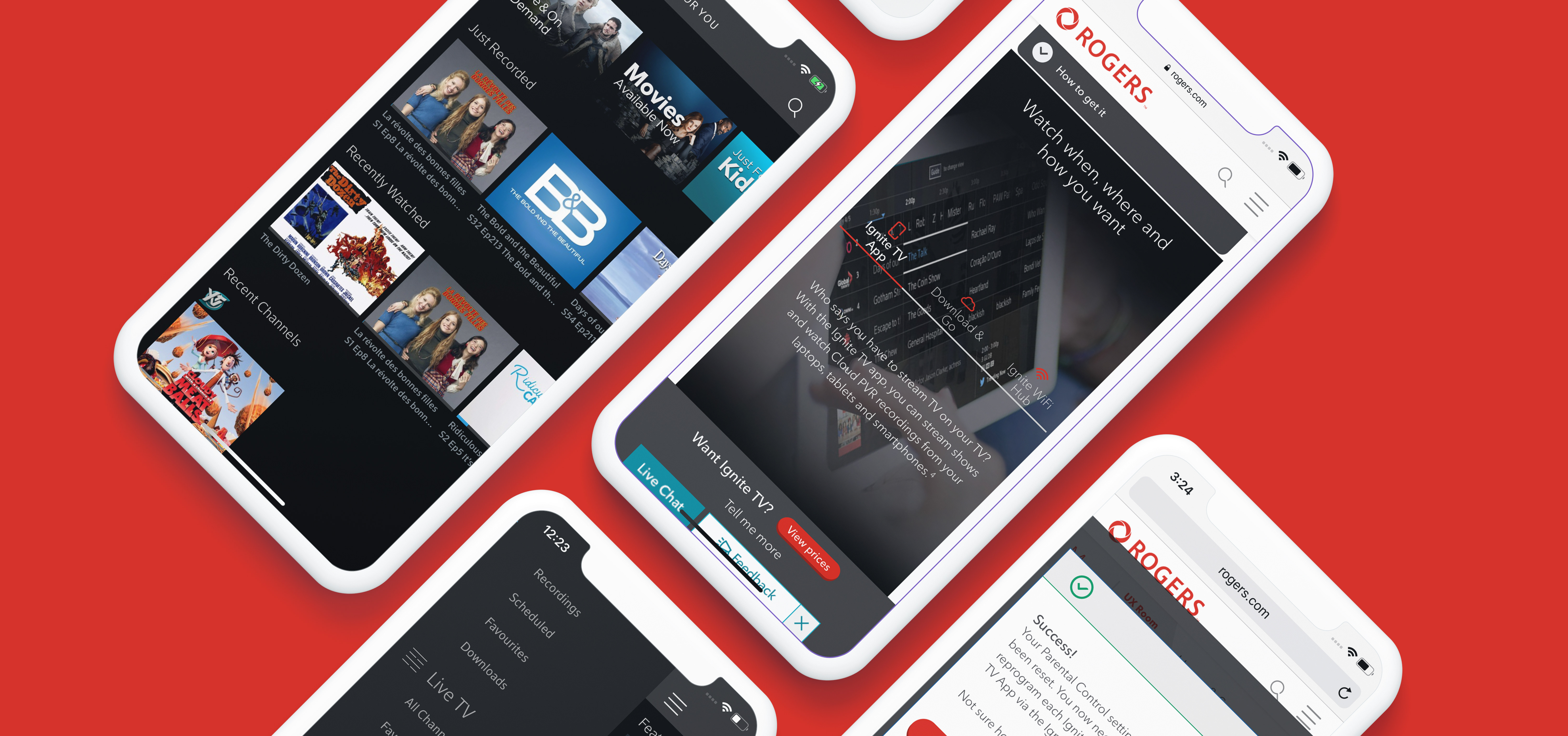
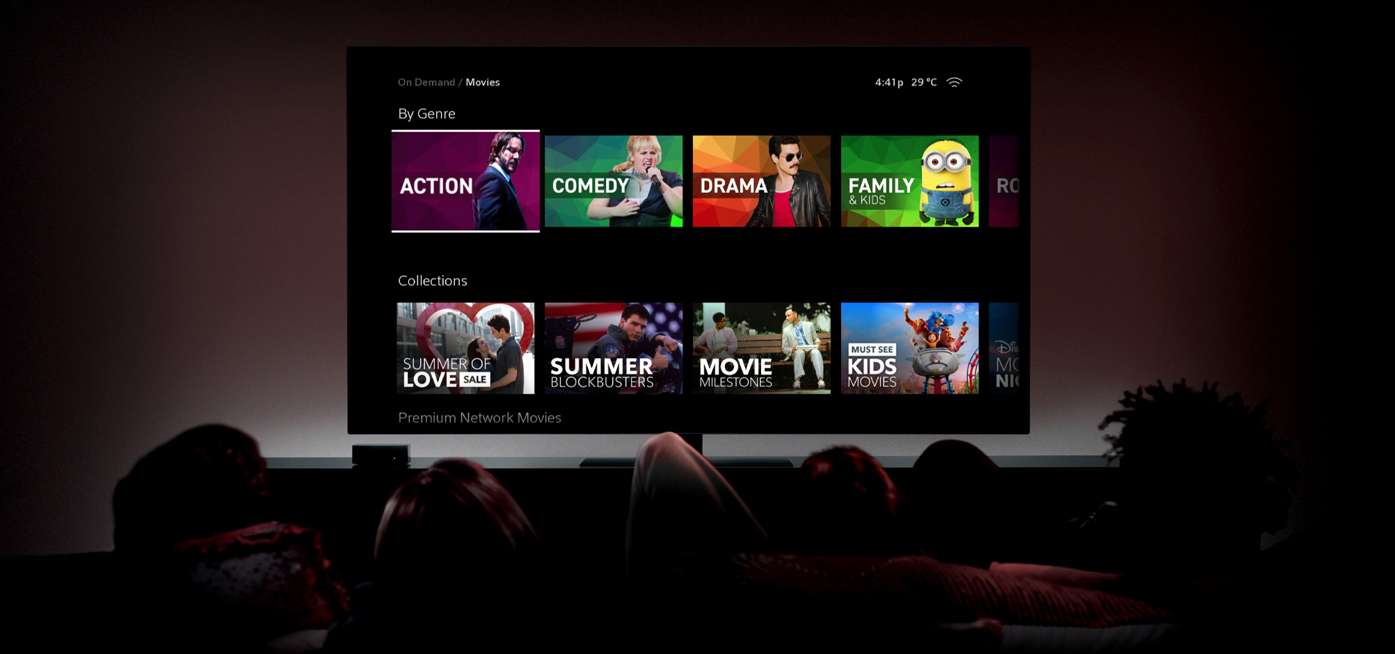
After sketching out some initial layouts, tiles were created in Adobe Illustrator to quickly explore different layouts, visual treatments, image content, and text styles. Once the look of the tile was chosen, they were placed into mockups for refinements. Placing the tiles into mockups allowed us to assess how the tiles would look side by side and laid out on the page. Furthermore, it also gave an accurate representation of how the tile would look in your hand on the mobile app, or if it still was effective 10 feet away on the TV.
After sketching out some initial layouts, tiles were created in Adobe Illustrator to quickly explore different layouts, visual treatments, image content, and text styles. Once the look of the tile was chosen, they were placed into mockups for refinements. Placing the tiles into mockups allowed us to assess how the tiles would look side by side and laid out on the page. Furthermore, it also gave an accurate representation of how the tile would look in your hand on the mobile app, or if it still was effective 10 feet away on the TV.
INSIGHTS
Through this exploration a couple guidelines were established: colour must be used sparingly, images need to be uncluttered and simple, and the text needs to be big and clear, easily readable on all devices.
Through this exploration a couple guidelines were established: colour must be used sparingly, images need to be uncluttered and simple, and the text needs to be big and clear, easily readable on all devices.
Outcome
By comparing analytics and metrics from the previous tiles, clicks have increased on the tv platform by 20%, leading to more videos being discovered, and watched in sequence. Trends are showing that users have been found to also be spending more time on the Rogers YouTube page, specifically within the newly created and curated playlists.
Next Steps
Following the success of the Help tiles, more videos are being created, and the newly established style is being applied to each of them. The goals for the future are to expand the brand across more categories and unify the brand, making it look cohesive and professional.


